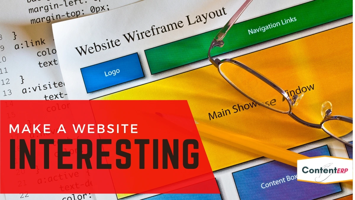
How to make a website interesting
A website can be interesting, engaging, and fun to visit – but it requires a lot of work. This article will show you how to make a website interesting and engaging by following a few simple tips.
Creating an Interesting Website
There are a few important things to remember when creating an interesting website.
First, think about your audience and try to cater to their interests. Second, make sure your website is visually appealing and easy to navigate. Third, use interesting and unique content to engage your visitors.
Making Your Website Interesting
There are several ways to make your website more interesting and engaging. You can add visually appealing elements such as videos, images, and infographics. You can also use interactive elements such as quizzes, calculators, and polls. Additionally, you can add interesting content such as articles, blog posts, case studies, and white papers.
Websites need to be well-designed and fun to interact with.
It’s not just a project. It’s a community and a business too!
So what are the best ways to create an easy-to-use, fun, and user-friendly website?
Create a great logo
A logo is the first thing a user sees when they visit a website.
- A logo is the face of your company and the first impression a user has of your website.
- A good logo will make your website easy to use and will help users easily be able to locate information.
- It’s not always about a “designer’s dream” logo that looks great on a piece of paper.
- A logo reflects your business and should be easy to understand even if they are reading it off a piece of paper.
Use your logo on the homepage of the website and also on the header and footer. Make sure that it reflects the needs of your target market.
Use portrait imagery.
People prefer to see themselves in the images used on a webpage. While it’s true that you need to include both an image and a corresponding text, make sure to use a high-resolution image that is large enough for the user to see it clearly.
Use the full webpage.
A website is more than just a few pages. You can use the full web page, not just the header and footer. This will help to add to the appeal of your website.
Include some customizable icons.
Include a few custom icons to spice up the design of your site. You can always use the default icons provided by your website hosting company.
Keep the layout simple.
Good design doesn’t come with a lot of frills. White space (empty space) is the best bit of design because it helps your visual hierarchy and your content to be clear and easy to understand. A good rule of thumb is that the more white space you have, your website design will be better. Minimize distractions and keep the clutter to a minimum.
Use simple colors & textures.
If you’re unsure what colors to use, go for the classic ones. A plain website design with simple colors and textures will help build trust and confidence with your audience.
USE SIMPLE, CLEAR & TO THE POINT GRAPHICS.
There are various ways to use graphic elements to convey specific ideas, but be careful not to overuse them. If you use too many graphics, it will become a distraction to your website visitors.
Make navigation easy to follow.
Users won’t waste time trying to find what they need by making navigation clear and easy to use. The order of navigation is a key factor in how people use sites.
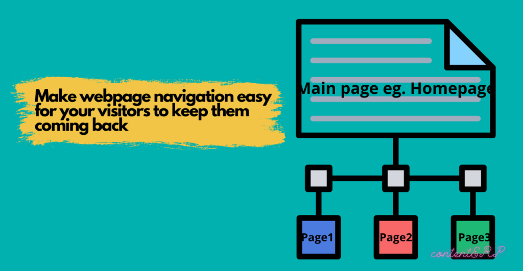
If it doesn’t make sense to visit the main page first, it’s likely not worth visiting. Simple and clear site navigation can be organized by category and use the same color scheme throughout the site to make it easier to find what you need.
More than just text
While it’s important to include text in your site’s navigation, it’s equally important to include visual elements. When people visit your site, they want to see what’s happening. A photo gallery can give visitors a sense of what’s behind the products they’re looking at.
Use clear calls to action.
Incorporate clear calls to action (CTA) into your content and on your site. A CTA is a statement that indicates what a visitor must do when they’re on your site. For example, if you want people to sign up for your newsletter, you should include a CTA that directs them to the sign-up form.
With content, less is more.
When you write your content for your site, consider what you’re trying to achieve. The content you provide should support your calls to action, and it should be easy to find and understand. Designing your site for SEO is essential, but having the right content is even more important.
Use visual elements to brand your website.
It’s easy to make a website look great, but visitors will have difficulty trusting it if it doesn’t convey the right brand and messages. The New York Public Library site is an excellent example of how a simple color palette can add a sense of class to a website.
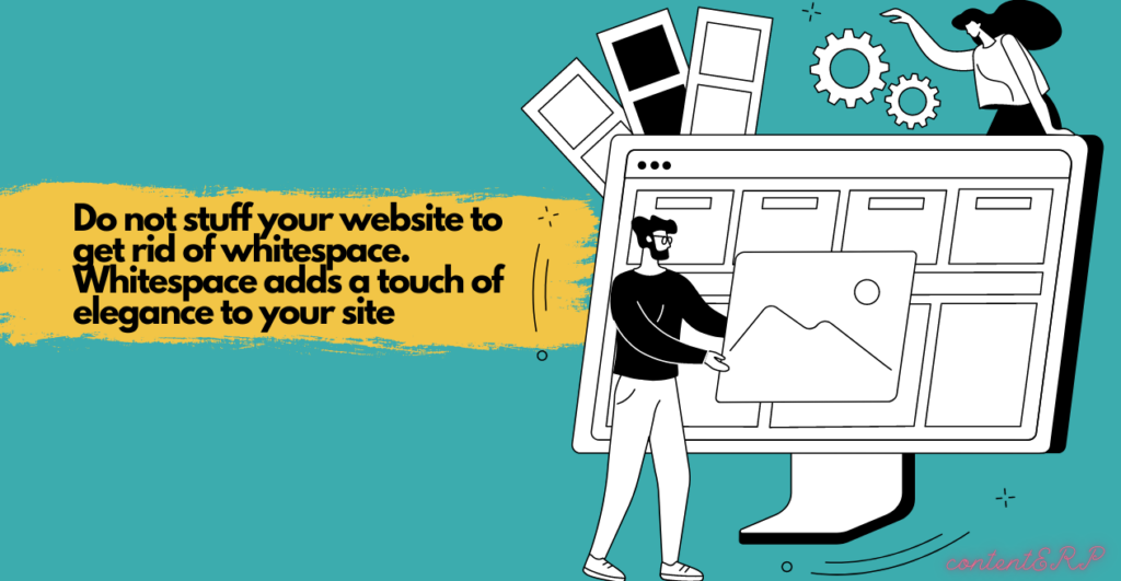
Don’t be afraid of whitespace.
White space—particularly negative space—is an important element of a good design. Space between text and images can make your content more legible. White space also helps give the page a clean, modern feel.
Use Visual Elements As An Intro.
Including a full visual element on a page is not always possible. But when you do, use them as an intro for your content. This includes items like a logo or company tagline.
Enhance your website design with eye-catching colors.
Color is a powerful tool for creating a mood and making an impact. While using bold, bright colors on your website may be tempting, remember that they can be distracting and even confuse your audience.
When designing your website, it’s important to know where your audience is and what they want to see. If your audience is looking for information and you’re trying to engage them, use calming colors and create trust.
The National Library of Medicine (NLM) website is a great example of knowing your audience. It uses a calming palette of blues, greens, and browns that would be familiar to anyone familiar with the NLM and the National Institutes of Health.
Incorporate attractive, easy-to-read fonts.
Fonts are the tools you use to communicate. Visually appealing fonts can help your audience remember your brand better and recall what you’re trying to communicate. Make sure your typography is clean and uses a sans-serif font. To improve readability, the text in this case view is set in a light sans-serif font.
Using the right fonts reduces the risk of glare. When you use a bold or large font, it’s hard for the eye to focus on the finer details. However, when the text is clean, it’s easy to read.
Jump into e-commerce!
If you sell products online, you might not be doing enough to monetize your site. Take a look at how you can bring more visitors to your site and convert them into customers. You can either create a landing page that drives traffic to an e-commerce site or add an e-commerce tab to your existing site.
Engage users with video and rich images.
Video is a powerful way to engage your site visitors and connect with your brand. It can help explain your products and services and can also be used to highlight new products or special offers.
The website for the National Park Service uses a gallery of beautiful images of the parks and monuments throughout the country. In addition to providing useful information about the parks, it showcases the beauty of the sites.
Procter & Gamble uses images of their products on their website, the best of which are included in the online gallery. The images are high-resolution, and they appear large and bright, ensuring quality.
Include well-designed and written headings.
Headings are essential in a website. They’re the foundation of your page and help the reader understand what to expect from the site. Google uses headings to determine the page’s overall importance.
They’re more than just a way to make your site look great. Headings are how you convey the most important information to your user. In a study done by Donnie Berkowitz and colleagues, they found that the introduction of headings made a significant difference in terms of user engagement.
When there were no headings, users only engaged with the text for a total of 6 seconds before leaving the page. Whereas, when there were headings, the users read the text for an average of 8 seconds before leaving the page.
The difference was dramatic. Headings are a part of the design process; they’re an opportunity for you to make your user’s experience as enjoyable as possible.
Catch your 404s.
When a site gets visited without an appropriate link (a URL), it’s called a “404,” and it’s bad. When it happens, the user is likely to leave. Even worse, it can look like your site is down when someone else is viewing it. Don’t let your users get confused or frustrated.

Four hundred four pages are not the end of the world, but they can be a pain. You can do a lot to make it easier for visitors to navigate your site, navigate your site, and even recover from 404 pages.
It’s valuable to see how many 404 pages you’ll be getting. Some services can help you find out how many 404 pages you have and how many you can expect to have in the coming days or weeks. Depending on what you’re selling, that could be a big problem.
Be responsive & mobile-friendly.
It’s no secret that people spend more time with their mobile devices than on any other device. Therefore, it is important to be mobile-friendly and responsive to provide the best user experience possible.
The simple answer is, “YES!” The mobile experience is not just different. It’s different because of the challenges mobile devices present. One such challenge is the screen size. A mobile screen can be half the size of a desktop screen, making it challenging to design a mobile-friendly website that works well on both devices. Some things, such as images, text, and videos, don’t work well on a mobile device.
The other challenge is that mobile users don’t browse websites as they do on desktops. They tend to scroll through the screen rather than click on links. The more people you serve on mobile devices, your mobile audience will be bigger. However, there are no simple strategies for getting started.
The final word
Web designers have many different techniques that they use to design a site. The process of building a website from scratch is long and requires the skill of a web designer. But some methods can be employed to speed up the process, and a website lacking in any of these attributes will ultimately cause a slow site. We recommend that you consider the main elements of a good website when creating your site and try to include them in your site.